Become Skilled and Confident Data Professional
Welcome to DataValley – Your Ultimate Learning Companion! Embark on a Learning Journey with Us Are you ready to unlock your full potential and achieve your learning goals? Look no further! DataValley is not just a website; it’s your dedicated partner in the incredible journey of learning and mentorship.
Learn at your own pace, anytime, anywhere.


About Us
We don't Sell Courses ..
We Empower your Data Career through Professional Tracks
We are passionate about helping students reach their full potential by providing one-on-one, customized tutoring that adapts to each learner’s style and pace. With a focus on building confidence and mastery in every subject, we strive to make learning enjoyable and impactful.

Well Designed Tracks
Follow expertly crafted learning paths that take the guesswork out of mastering data.Learn exactly what you need, in the right order, to become job-ready.
No Individual Courses, we provide Full packages to enable your career

From Foundation to Projects
Build strong foundations, then apply them in real-world, portfolio-ready projects.We don’t just teach theory — we train you to deliver results.

Monthly Live Follow ups & Community
Join our monthly live sessions to get answers, insights, and ongoing motivation.Stay supported, stay on track, and never feel alone in your learning journey.
Why Choose Us
We Understand How overwhelming and confusing starting in the data field with so much to learn and so many paths you can walk. You may feel confused or unsure of your next steps. We at DataValley understand you and that is why we provide you with.
We Understand that science and theory are the building blocks, however learning to apply knowledge in real-world scenarios is essential too, in DataValley we bridge the gap between both. We will help you
understand Theory and how to apply it in a real-world scenario.

Expert Tutors
Unlock the power of mentorship with our team of seasoned experts. Our mentors are here to guide you, inspire you, and share their valuable insights to accelerate your learning.

Diverse Learning Resources
Explore a vast array of learning resources tailored to suit your needs. We've got everything from engaging video lessons and interactive quizzes to in-depth articles.

Partner in Your Success
We don't just offer courses; we are your partners in success. Our commitment goes beyond providing information. We are dedicated to helping you achieve your goals, overcome challenges, and celebrate your victories.
Limited Time 20% Discount
Popular Courses
Choose from our Professional Tracks
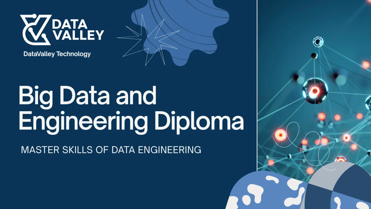
Big Data &
Data Engineering
Full Track
$550. $420
20 Courses
100+ Hours
Monthly Updates
Monthly Live Q&A
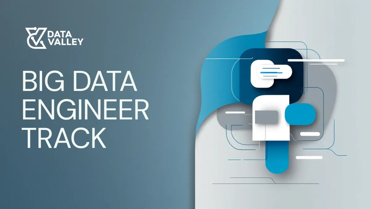
Big Data Engineering
Full Track
$400 $340
13 Courses
50+ Hours
Monthly Updates
Monthly Live Q&A
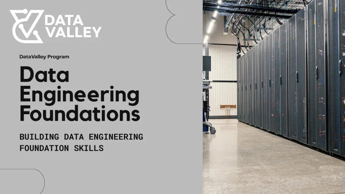
Data Engineering Foundations
Full Track
$300. $250
7 Courses
40+ Hours
Monthly Updates
Monthly Live Q&A
General Questions
Frequently Asked Question
How Payment works?
Once we recieved your request and we confirmed the requirements with you, you will be asked to pay then services will be provisioned
Do we have recurring payments?
Payment terms and conditions will be agreed on once we have the full requirements for your lab or application

Success Stories That Inspire
Our personalized approach has made a real difference in the lives of students. Here’s what they have to say about their journey with us.
م ايمان عثمان التحقت بالكورس لهدفين مساعدتي في تصميم مشروع رسالة الدكتوراه وكمان في استلام المشاريع الخاصه بتطبيقات المنصه الرقميه بعملي الكورس متميز - الوحيد في علم هندسة البيانات باللغه العربيه الشرح رائع جدا ويلمس مشاكل فعليه. كان ليه فائده كبيره في فهم علم هندسة البيانات
Dr. Eman Osman
R&D GM - Cairo Water Company
Data Valley is a gem, the amount of experience and detail oriented the instructor had is exceptional, I am glad that I had the opportunity to be part of the course to be able to expand my career with confidence
Tamer Shamseldin
Solutions Architect
Thank you very much for this excellent Diploma.The Diploma is very strong and explains everything in detail. The service provided by the platform is also very good.
Omar Taha Mohamed
Steam & Robotics Engineer
مساء الخير حابه اشكر مهندس احمد و Data Valley على كورس Big Data الكورس كان فيه تفاصيل كتير مهمة وحتى النقط إلى كان عندى معرفة بيها استفدت معلومات جديدة فيها ربنا يوفقكوا دائما
Dina Alsayed
Data Analyst
The Data Valley Diploma is comprehensive and well-structured, covering many topics with a great balance of theory and practice. It’s definitely worth the investment for anyone looking to upskill in data field
Ziad Mahmoud Huseein
Data Engineer
I recently completed the Data Engineering course at Data Valley, and I found it to be very informative and engaging. The course covered essential topics such as data pipelines, ETL processes, Big data, and database management.
The instructors were knowledgeable and provided real-world examples that made the concepts easier
Yaheya Atef Ibrahim
Data Engineer
استمعت في رحلة أكثر من 4 شهور بالدبلومة وانعكس ذلك على ادائي في العمل وادائي في الانترفيوز أصبح أفضل بكثير وهذه اهم النقاطنقاط القوةالسلاسة في الشرح وعرض المعلومةطريقة ترتيب الكورسالتعرض لمواضيع كثيرة وإعطاء كل موضوع حقه تماما- مهما طال الوقتالمهندس احمد شخصية هادئة وتجيد التعامل مع مختلف الشخصيات ويجاوب ويساعد مع جميع الأشخاص.من النقاط المقترحه للتحسين هو اضافه المزيد من المشاريع.وفي النهاية القيمة المضافة مقابل السعر تعتبر ممتازه وجزيل الشكر علي المجهود المبذول.
Ahmed Zakaria Fathy Mohamed
BI Manager
بجد الكورس بالنسبالي كان كويس و مفيد جدا بالذات ان بشمهندس احمد كان بيركز انه يشرح الأساس اكتر من الاداه و ده مع الوقت بيديك الفرصه انك تبقي مرن مع أي اداه جديده علشان انت عندك اساس قوي و مع التجربه و التدريب ب ايديك الموضوع بيثبت بشكل كويس اوي ف شكرا جدا علي الدبلومه🙏🙏
Eslam Yasser
Data Engineer
I recently completed the Data Engineering course at Data Valley, and it was an incredibly insightful and engaging experience. The curriculum covered a wide range of essential topics, including data pipelines, ETL processes, Big Data, and advanced database management techniques.
The instructors were highly knowledgeable and skilled at breaking down complex concepts, often using real-world examples that made the material much easier to grasp.
Mostafa Nizar Ibrahim
Data Engineer
Best Online Learning Platform
Discover the Best Online Learning Platform for Your Success
Our platform brings expert-led courses and supportive learning to help you succeed.
Friendly Environment & Expert Tutor
Well Structured Courses
Community and Live Q&A to Support your journey

Flexible Payment Options


We believe learning data skills is a critical skill in the coming decade, We would like to help all who are interested to learn and take the first steps in any data skills like data engineering, data scientists, and data analysis, regardless coming from any professional background
Links
Newsletter
Join our community to stay updated on the latest courses, exclusive content, and learning resources. Subscribe now and take the next step in your educational journey!