Use Case Introduction
Now that you’ve seen how data science can be applied in real life, we’ll walk through a step-by-step project on how to predict the likelihood of a stroke using machine learning, we’ll also attach a link to download the code and dataset in case you want to try building the model yourself.
According to the World Health Organization, stroke is the 2nd leading cause of death globally. it occurs when there is a problem with blood circulation, preventing the brain from receiving the nutrients and oxygen carried by blood, which causes the immediate death of brain cells. This tutorial will train and test a binary logistic regression model to predict the likelihood of a stroke based on some clinical features from 5110 records.
First, we’ll conduct exploratory data analysis to understand the dataset properties. Second, we’ll write a few lines of code to clean the data we’ve just assessed in the previous step. Next, we’ll select the most related features to the predicted output in a process called “Feature selection”. We can do an additional step before building the model to balance the data we have, so it’s not applicable in every situation. Only when the dataset is unbalanced, do we use a “Re-sampling technique” to get a better prediction accuracy.
Afterward, we’ll build the model and evaluate its accuracy using “Classification report” and “ROC curve”. Then we’ll test the built model with new data and see if it’s able to predict a stroke. Finally, we’ll experiment with the variables in our dataset and visualize their relationships.
Let’s dig in!
Data Exploration – Assessing
In this stage, we display the data we’re going to import to assess its quality and tidiness.
Quality dimensions or aspects are mainly:
- Completeness (checking if there are any missing records).
- Validity (Checking if the values displayed are ‘valid’, i.e. data that follow certain known rules)
- Accuracy (a significant decrease or increase in a value is considered ‘inaccurate data’)
- Consistency (There should be only one way to represent or refer to a value, otherwise the data is considered to be ‘inconsistent’)
#import the necessary libraries
import pandas as pd
import matplotlib.pyplot as plt
import seaborn as sns
import math
import numpy as np

#read the dataset and display its shape
stroke_data =pd.read_csv('healthcare-dataset-stroke-data.csv')
stroke_data.shape

#understand the dataset’s properties
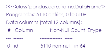
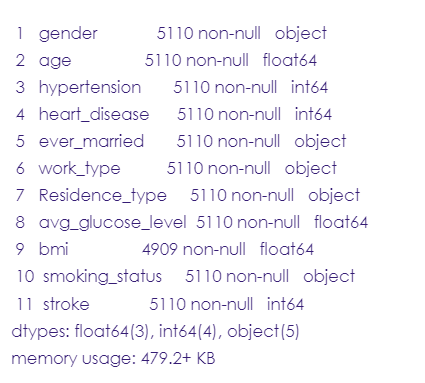
stroke_data.info()
#read the first 5 rows in the dataset
stroke_data.head(5)
#read the last 5 rows
stroke_data.tail(5)
#understand the dataset’s statistical summary
stroke_data.describe()
# Gender column
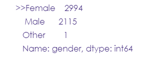
stroke_data.gender.value_counts()
# Age column
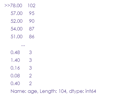
stroke_data.age.value_counts()
# Hypertension column
stroke_data.hypertension.value_counts()

# Heart disease column
stroke_data.heart_disease.value_counts()

# Ever-married column
stroke_data.ever_married.value_counts()

# Work type column
stroke_data.work_type.value_counts()
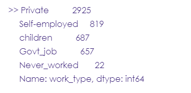
Note: 687 records in this column are assigned to the ‘children’ category, which is not a suitable work type.
# Residence type column
stroke_data.Residence_type.value_counts()

# Average glucose level column
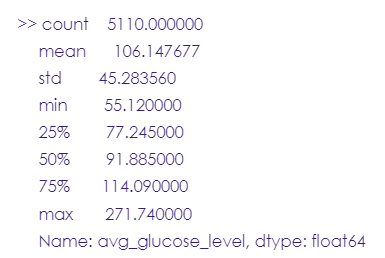
stroke_data.avg_glucose_level.describe()
# BMI column
stroke_data.bmi.isnull().sum()

# Smoking status column
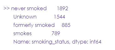
stroke_data.smoking_status.value_counts()
# Stroke column
stroke_data.stroke.value_counts()

Data Cleaning
- Drop the ID column since it’s unnecessary for our analysis.
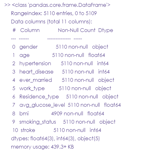
- Change the format of ‘hyper tension’, ‘heart disease’, ‘stroke’, and ‘Gender’ to category.
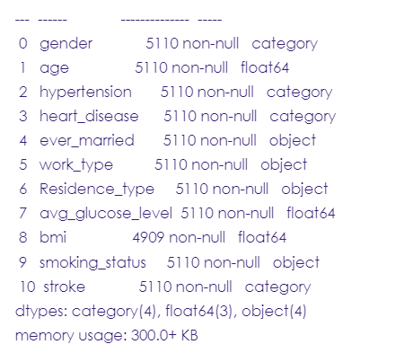
- Fill the 201 null values in the ‘BMI’ column.
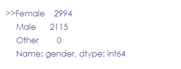
- Drop the ‘other’ category in the gender column.
- Add values under the “children” category to those of the never worked category.
- Create an ‘age category’ column.
# drop the ID column.
stroke_data= stroke_data.drop(columns= 'id')
stroke_data.info()
# Change the format of 'hyper tension', 'heart disease', 'stroke' to category.
stroke_data['hypertension'] = stroke_data['hypertension'].astype('category')
stroke_data['heart_disease'] = stroke_data['heart_disease'].astype('category')
stroke_data['stroke'] = stroke_data['stroke'].astype('category')
stroke_data['gender'] = stroke_data['gender'].astype('category')
stroke_data.info()

# Fill the 201 null values in 'BMI' column.
# Let's ignore the 'other' column since it will be removed.
# We will fill each missing value in 'bmi' column with the mean value for each gender
stroke_data.groupby('gender')['bmi'].mean()
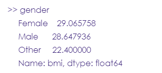
# Mean bmi for male = 28.6 // mean bmi for female = 29, so pretty much the same value
stroke_data = stroke_data.fillna(stroke_data.mean())

# Now let's check that all null values are replaced with the mean values.
stroke_data.bmi.isnull().sum()

# Drop the 'other' category in the gender column.
other = stroke_data[stroke_data['gender'] == 'Other'].index
stroke_data.drop(other, axis=0, inplace= True)
stroke_data.gender.value_counts()
# Add values under “children” category to those of never worked category.
stroke_data.work_type=np.where(stroke_data['work_type']=='children','Never_worked',stroke_data.work_type)
stroke_data.work_type.value_counts()

# Create 'age category' column.
conditions= [(stroke_data['age'] <=14),
                 (stroke_data['age'] >=15) & (stroke_data['age']<=24),
                 (stroke_data['age'] >=25) & (stroke_data['age']<=64),
                 (stroke_data['age'] >= 65)
]

values= ['Child','Youth','Adult','Senior']

#Create the new column
stroke_data['Age_Category']= np.select(conditions,values)

#Now we check if the new column is added
stroke_data.head(5)
Feature Selection
In this step, we select the most related features to our target output (stroke), this can be done by using the “SelectKBest” library to run a chi-squared statistical test & select the top 2 features.
#Rearrange the columns
stroke_data = stroke_data[["gender", "age", "hypertension", "heart_disease", "ever_married", "work_type", "Residence_type", "avg_glucose_level", "bmi", "smoking_status", "Age_Category", "stroke"]]

#Assign numeric values to the binary and categorical columns
from sklearn.preprocessing import LabelEncoder

#create a copy from the original dataset and call it “stroke_data2”
stroke_data2= stroke_data.copy()

number= LabelEncoder()
stroke_data2['gender']= number.fit_transform(stroke_data2['gender'])
stroke_data2['ever_married']= number.fit_transform(stroke_data2['ever_married'])
stroke_data2['work_type']= number.fit_transform(stroke_data2['work_type'])
stroke_data2['Residence_type']= number.fit_transform(stroke_data2['Residence_type'])
stroke_data2['smoking_status']= number.fit_transform(stroke_data2['smoking_status'])
stroke_data2['Age_Category']= number.fit_transform(stroke_data2['Age_Category'])
stroke_data2.head(5)
#Using the SelectKBest library to run a chi-squared statistical test & select the top 3 features that are most related to the output

from sklearn.feature_selection import SelectKBest
from sklearn.feature_selection import chi2

X= stroke_data2.iloc[:,0:11] #all features
Y= stroke_data2.iloc[:,-1] #target (stroke)

best_features= SelectKBest(score_func=chi2, k=3) #function that selects the top 3 features.
fit= best_features.fit(X,Y)

#Creating dataframes for the features and the score of each feature.
stroke_scores= pd.DataFrame(fit.scores_)
stroke_columns= pd.DataFrame(X.columns)

#Create a data frame that combines all the features and their corresponding scores.
features_scores= pd.concat([stroke_columns, stroke_scores], axis=1)
features_scores.columns= ['Features', 'Score']
features_scores.sort_values(by = 'Score')
After running the test, it turned out that the most related features to the target output are age and average glucose level is given that they have the highest scores: 3663 and 1701, respectively.
Build the Model
The data turned out to be “unbalanced” during the exploratory phase. We have 4861 people who did not have a stroke and only 249 who did, so after developing the model and testing it, it had a 96 percent accuracy, and we’re getting this unusually high accuracy because the model was able to forecast the majority class, which is 0 people (no stroke).
To correct this, we used a “Re-sampling approach,” specifically “under-sampling,” which means we removed random records from the majority class until the majority and minority classes were balanced.
*Note Every bit of information matters in data science, especially when dealing with medical conditions, which is why the main negative of under-sampling is that we may lose some information when eliminating records that could have been useful in future studies.
Before Sampling
# class count
class_count_0, class_count_1 = stroke_data['stroke'].value_counts()

# Separate class
class_0 = stroke_data[stroke_data['stroke'] == 0]
class_1 = stroke_data[stroke_data['stroke'] == 1]# print the shape of the class

print('class 0:', class_0.shape)
print('class 1:', class_1.shape)

#Plotting the stroke column
g = sns.countplot(stroke_data['stroke'])
g.set_xticklabels(['No stroke','stroke'])
plt.show()
After Sampling
# In under-sampling, the simplest technique involves removing random records from the majority class.
# Under-sampling can be defined as removing some observations of the majority class. This is done until the majority and minority classes are balanced out.

# class count
class_count_0, class_count_1 = stroke_data['stroke'].value_counts()

# Separate class
class_0 = stroke_data[stroke_data['stroke'] == 0]
class_1 = stroke_data[stroke_data['stroke'] == 1]# print the shape of the class

class_0_under = class_0.sample(class_count_1)
test_under = pd.concat([class_0_under, class_1], axis=0)


print("total class of 1 and0:",test_under['stroke'].value_counts())# plot the count after under-sampeling
test_under['stroke'].value_counts().plot(kind='bar', title='count (target)')
Now, we’ll split the dataset into X and Y:
X= test_under[['age', 'avg_glucose_level']]
y= test_under['stroke']
Next, we’ll split the dataset into train and test:
from sklearn.model_selection import train_test_split
from sklearn.linear_model import LogisticRegression
X_train,X_test,y_train,y_test = train_test_split(X,y,test_size=0.4,random_state=100)
Notes:
- The number in “test size” refers to the proportion of the dataset used in testing the model. So, 0.4 means 40% 60% split.
- The random state is a parameter of the train_test_split function. If a certain value is specified to it, for example, 42, then it means that the same values appear in the train and test sets every time we run the function. This is only important in terms of reproducibility in case you or someone else runs the code in the future, it’s better to have the same results.
#create a logistic regression body
logreg= LogisticRegression()
logreg.fit(X_train,y_train)
#now, we’ll try using the model to predict values for the test dataset
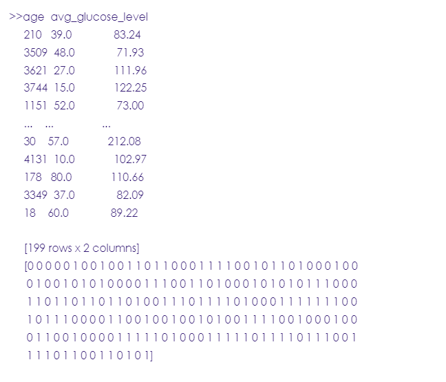
y_pred=logreg.predict(X_test)
print (X_test) #test dataset
print (y_pred) #predicted values
Key terms
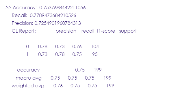
- Accuracy: a score used to evaluate a model’s performance. If it ranges between 70% and 80%, then the model is good, between 80% and 90%, the model is excellent.
- Recall: it measures the model’s ability to correctly predict the true positives (the case when the value is positive and the model did predict it as positive. In our case, the true positives are the people who had a stroke and the model successfully predicted that they had a stroke)
- Precision: it’s the accuracy of positive predictions. In this project, you’ll find that the precision score is 72%, meaning that when the model predicted a stroke, it was correct 72% of the time.
- F1-score: it’s a metric that combines both the precision and recall into one score, it ranges from 0 to 1. the closer to one, the better the performance.
- Support: an integer referring to the actual number of occurrences of each class in the dataset. i.e. 0 and 1.
Now, let’s evaluate the model we’ve just built using model evaluation metrics such as accuracy, recall, and precision.
from sklearn import metrics
from sklearn.metrics import classification_report
print('Accuracy: ',metrics.accuracy_score(y_test, y_pred))
print('Recall: ',metrics.recall_score(y_test, y_pred, zero_division=1))
print("Precision:",metrics.precision_score(y_test, y_pred, zero_division=1))
print("CL Report:",metrics.classification_report(y_test, y_pred, zero_division=1))
ROC Curve
The receiver operating characteristic curve is used to display the sensitivity & specificity of the logistic regression model by calculating the true positive rate & the false positive rate.
#define metrics
y_pred_proba= logreg.predict_proba(X_test) [::,1]

#Calculate true positive and false positive rates
false_positive_rate, true_positive_rate, _ = metrics.roc_curve(y_test, y_pred_proba)

#Calculate the area under curve to see the model performance
auc= metrics.roc_auc_score(y_test, y_pred_proba)

#Create ROC curve
plt.plot(false_positive_rate, true_positive_rate,label="AUC="+str(auc))
plt.title('ROC Curve')
plt.ylabel('True Positive Rate')
plt.xlabel('false Positive Rate')
plt.legend(loc=4)
The area under the curve (AUC) is 0.84, which is very close to one, meaning that the model did a great job.
Now, if we have other patients of different ages or glucose levels, the model can predict if they may have a stroke or not.
#This dataset is fictional and for illustrating only.
new_patients= {'age': [20, 35, 70, 80, 90, 100], 'avg_glucose_level': [120, 140, 160, 200, 170, 150]}
stroke_new= pd.DataFrame(new_patients, columns= ['age','avg_glucose_level'])
stroke_new
Now let’s try the model on the new dataset:
X= stroke_data[['age', 'avg_glucose_level']]
y= stroke_data['stroke']
X_train,X_test,y_train,y_test = train_test_split(X,y,test_size=0.25,random_state=0)
logreg= LogisticRegression()
logreg.fit(X, y.values.ravel())
new_patients= {'age': [20, 35, 70, 80, 90, 100], 'avg_glucose_level': [120, 140, 160, 200, 170, 150]}
stroke_new= pd.DataFrame(new_patients, columns= ['age', 'avg_glucose_level'])
y_pred=logreg.predict(stroke_new)
print (stroke_new)
print (y_pred)
From the above results, the fifth individual, a 100 years old and has a blood glucose level of 150, has the highest risk of a stroke. This backs up what we observed in the “Feature selection” step: older age and higher glucose levels are the two most significant risk factors for strokes.
Analysis & Visualization
The relation between ‘Age’ and ‘Stroke’ according to the Age range
fig,ax = plt.subplots(figsize = (4,6))
#Create a dataset that shows each age value and its corresponding stroke state
age_data= pd.concat([stroke_data['age'], y], axis=1)

#Create a dataset for the plot
age_plot= pd.melt(age_data, id_vars= 'stroke', var_name= 'age')

#Create the plot
sns.boxplot(x= 'age', y= 'value', hue= 'stroke', data= age_plot, palette="Set2")
The relation between ‘Age’ and ‘Stroke’ according to the Age category
fig,ax = plt.subplots(figsize = (8,10))
#Create a dataset that shows the age category and its corresponding stroke state
agecat_data= pd.concat([stroke_data['Age_Category'], y], axis=1)

#Create a dataset for the plot
agecat_plot= stroke_data[['Age_Category', 'stroke']].value_counts().reset_index()

#Create the plot
sns.barplot(x= 'Age_Category', y= 0, hue= 'stroke', data= agecat_plot, palette="Set2")
It’s clear from the plot that older patients ‘seniors’ (60-80 years) are more likely to have a stroke than younger people, so age is a crucial factor in predicting strokes.
The relation between ‘Glucose level’ and ‘Stroke’
fig,ax = plt.subplots(figsize = (6,8))
#Create a dataset that shows each glucose level value and its corresponding stroke state
glucose_data= pd.concat([stroke_data['avg_glucose_level'], y], axis=1)

#Create a dataset for the plot
glucose_plot= pd.melt(glucose_data, id_vars= 'stroke', var_name= 'avg_glucose_level')

#Create the plot
sns.boxplot(x= 'avg_glucose_level', y= 'value', hue= 'stroke', data= glucose_plot, palette="Set1")
From the visual we can notice that higher glucose levels are associated with a higher risk of a stroke, also there’re too many outliers. Glucose levels ranging between 80-120 are not a precise indicator to predict a stroke since some patients with this glucose level had a stroke and others didn’t.
The relation between ‘BMI’ and ‘Stroke’
fig,ax = plt.subplots(figsize = (6,8))
#Create a dataset that shows each BMI value and its corresponding stroke state
bmi_data= pd.concat([stroke_data['bmi'], y], axis=1)

#Create a dataset for the plot
bmi_plot= pd.melt(bmi_data, id_vars= 'stroke', var_name= 'bmi')

#Create the plot
sns.boxplot(x= 'bmi', y= 'value', hue= 'stroke', data= bmi_plot, palette="Set3")
We notice here that some patients with BMI ranging from (28-33) already had a stroke while others with the same BMI didn’t, so one’s body mass index isn’t necessarily correlated to a stroke.
The relation between ‘Gender’ and ‘Stroke’
fig,ax = plt.subplots(figsize = (6,8))
#Create a dataset that shows each gender and its corresponding stroke state
gender_data= pd.concat([stroke_data['gender'], y], axis=1)

#Create a dataset for the plot
gender_plot= stroke_data[['gender', 'stroke']].value_counts().reset_index()

#Create the plot
sns.barplot(x= 'gender', y= 0, hue= 'stroke', data= gender_plot, palette="Set2")
From the previous plot & table, it’s clear that females (140) were more likely to have a stroke than males (108).
The relation between ‘Hypertension’ and ‘Stroke’
fig,ax = plt.subplots(figsize = (6,8))
#Create a dataset that shows hypertension state and its corresponding stroke state
hypertn_data= pd.concat([stroke_data['hypertension'], y], axis=1)

#Create a dataset for the plot
hypertn_plot= stroke_data[['hypertension', 'stroke']].value_counts().reset_index()

#Create the plot
sns.barplot(x= 'hypertension', y= 0, hue= 'stroke', data= hypertn_plot, palette="Set2")
From the previous table, we notice that:
4364 patients are neither hypertensive nor had a stroke, and that shows a significant relationship and that’s also backed up by the hypertension score in the feature selection, where it was the fourth most related feature to strokes. 415 patients were hypertensive but didn’t have a stroke, so hypertension isn’t associated with strokes. 182 patients had a stroke but weren’t hypertensive, and that signifies that stroke isn’t correlated to hypertension. 66 patients both had a stroke and were hypertensive, so there is a slightly positive correlation.
The relation between ‘Heart disease’ and ‘Stroke’
fig,ax = plt.subplots(figsize = (6,8))
#Create a dataset that shows heart disease state and its corresponding stroke state
heart_data= pd.concat([stroke_data['heart_disease'], y], axis=1)

#Create a dataset for the plot
heart_plot= stroke_data[['heart_disease', 'stroke']].value_counts().reset_index()

#Create the plot
sns.barplot(x= 'heart_disease', y= 0, hue= 'stroke', data= heart_plot, palette="Set1")
From the previous, we notice that:
228 patients have heart disease but didn’t have a stroke, which implies that heart disease isn’t significantly associated with strokes.201 patients had a stroke but don’t suffer from heart disease and that signifies that strokes aren’t essentially associated with heart disease. 47 patients both had a stroke and suffered from heart disease and 4551 neither had heart disease.
The relation between ‘Marital status’ and ‘Stroke’
fig,ax = plt.subplots(figsize = (6,8))
#Create a dataset that shows marital status and its corresponding stroke state
social_data= pd.concat([stroke_data['ever_married'], y], axis=1)

#Create a dataset for the plot
social_plot= stroke_data[['ever_married', 'stroke']].value_counts().reset_index()

#Create the plot
sns.barplot(x= 'ever_married', y= 0, hue= 'stroke', data= social_plot, palette="Set1")
The data show that marriage is not strongly correlated to strokes.
The relation between ‘Work type’ and ‘Stroke’
fig,ax = plt.subplots(figsize = (6,8))
#Create a dataset that shows work type and its corresponding stroke state
work_data= pd.concat([stroke_data['work_type'], y], axis=1)

#Create a dataset for the plot
work_plot= stroke_data[['work_type', 'stroke']].value_counts().reset_index()

#Create the plot
sns.barplot(x= 'work_type', y= 0, hue= 'stroke', data= work_plot, palette="Set2")
It’s clear that the largest proportion of those who had a stroke is in the private sector (148), although it’s not that big of a number it’s worth taking into consideration.
The relation between ‘Residence type’ and ‘Stroke’
fig,ax = plt.subplots(figsize = (8,10))
#Create a dataset that shows work type and its corresponding stroke state
residence_data= pd.concat([stroke_data['Residence_type'], y], axis=1)

#Create a dataset for the plot
residence_plot=stroke_data[['Residence_type', 'stroke']].value_counts().reset_index()

#Create the plot
sns.barplot(x= 'Residence_type', y= 0, hue= 'stroke', data= residence_plot, palette="Set2")
It seems that residence type doesn’t have a significant effect on predicting strokes.
The relation between ‘Smoking status’ and ‘Stroke’
fig,ax = plt.subplots(figsize = (8,10))
#Create a dataset that shows smoking state and its corresponding stroke state
smoking_data= pd.concat([stroke_data['smoking_status'], y], axis=1)

#Create a dataset for the plot
smoking_plot= stroke_data[['smoking_status', 'stroke']].value_counts().reset_index()

#Create the plot
sns.barplot(x= 'smoking_status', y= 0, hue= 'stroke', data= smoking_plot, palette="Set2")
The result here is quite interesting, you must’ve expected that smokers have a higher risk of a stroke but the data shows that 735 smoker patients never experienced a stroke while 89 non-smokers already had a stroke, so unlike the usual, smoking status is not a good predictor of a stroke for these records.
Final Conclusion
This dataset has 5110 records and 12 columns representing 12 different clinical and demographic features.
From the analysis, we can conclude the following points:
1- Seniors have a higher risk of stroke compared to adults and youth, so it’s a good indicator.
2- The level of average glucose is correlated to strokes.
3- BMI isn’t highly related to strokes and for this dataset can never be considered a risk factor for strokes.
4- Gender data showed that both males and females have strokes but more females suffered from strokes than males.
5- Hypertension is definitely not correlated to strokes for this data since many hypertensive patients didn’t have a stroke and others who don’t do suffer from a stroke, the same conclusion applies for heart disease which surprisingly was not a probable risk factor.
6- Marital status, residence type, and smoking status are all weakly related to strokes for this dataset.
7- On the other hand, people working in the private sector showed a higher level of stroke than people with other work types.


