

In this article, we will analyze COVID-19 Dataset using Databricks unified analytics platform using the community edition of the platform, which is totally for free and you can use it as your playground to test Apache Spark applications in Python or R depends on your favorite API of development.
Dataset will be used in this tutorial is downloaded from the following link WHO-COVID-19-global-data make sure to download the dataset before moving on with the technical steps on this article.
Introduction to Databricks
Databricks is a powerful unified analytics platform that provides a set of products that covers all the needs of data engineers, data scientists, and provide them with the required tools to apply any type of transformation or business logic required in their projects with fully interactive notebooks, that they can build using the development API they are most comfortable with such as Python or R for example. In the following, section we will give a brief introduction of each product on the platform.
Databricks is a cloud platform you can choose from databricks products deployed on AWS or Azure which lets you focus on the business logic of your applications without the worrying about the underlying complexity of cluster management.
Data Science Workspace
It’s a collaborative environment for practitioners to run all analytic processes in one place, and manage ML models across the full lifecycle. with the interactive notebooks, you can explore, analyze, and visualize your data using any language from Python, R, Scala, and SQL. Data Science workspace supports many ML Libraries & Frameworks such as Keras, Tensorflow, XGBoost, Pytorch, and others, which makes it easy and flexible for you as a data engineer or a data scientist to put all your logic in a workspace without the need to export your work outside.
Find out more from Data Science Workspace
Unified Data Service
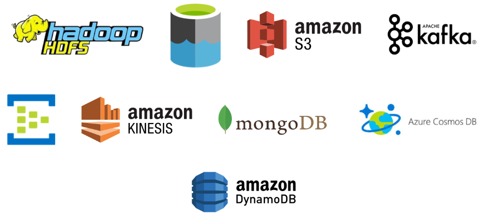
The Databricks Unified Data Service provides a reliable and scalable platform for your data pipelines, data lakes, and data platforms. Manage your full data journey, so you can ingest, process, store, and expose data throughout your organization. in data ingestion phase you can ingest your data from a variety of data sources such as Amazon S3, HDFS, Azure Cosmos DB, and many others. Data Engineers with unified data services can build scalable data pipelines using Python, Scala, R, or SQL.
At the end of your data pipelines, you can consume your data using business intelligence products such as Tableau, Power BI, Qlik, and others. For more information check out Unified Data Service
Redash
Data Visualization plays a crucial role in different phases of a data engineering or machine learning project, for example, in the data discovery phase, data visualization helps data scientists or machine learning engineers to discover and analyze his data distribution patterns, understand data anomalies, or identify outliers, at the delivery phase of the project a dashboard or standard reports help decision-makers to monitor output KPIs or machine learning engineers to monitor data model performance for example. Databricks provide Redash product which enables you to easily visualize, dashboard, and share your data. Using composed SQL and NoSQL queries you can design very interactive and dynamic dashboards, find out more information on Redash
COVID-19 Use Case – Prepare Data
In the following steps, we will work together step by step to import our data and start analyzing available information
Create Cluster
First, we need to create a databricks cluster so we can use it to execute our application, to create a cluster follow the next steps
1- Login to your community Edition account Community Login
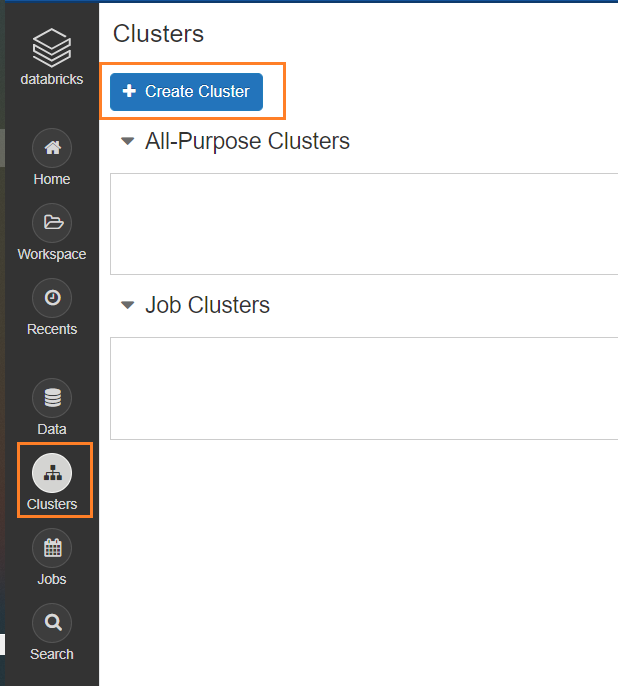
2- Click on Cluster, then Create Cluster button
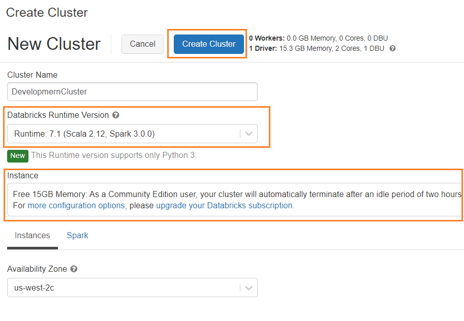
3-Enter Cluster name, and choose Runtime of the cluster from the drop-down list which indicates Spark version and databricks runtime version. Clusters created by community edition users will shut down after two hours of idle time
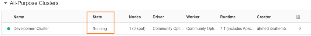
4- Once cluster is ready, you will see cluster status as running
Import Dataset
Before going into technical steps on how to import out data let’s first talk about Databricks File System (DBFS) which is a distributed file system available in Databricks clusters. in DBFS we have DBFS root which is the root directory for our uploaded datasets and sample datasets provided by Databricks, following is a summary of DBFS root directories as per Databricks documentation.
/FileStore –> Imported data files, generated plots and uploaded libraries.
/databricks-datasets –> Sample public datasets.
/databricks-results –> Files generated by downloading the full results of a query.
/databricks/init –> Global and cluster-named (deprecated) init scripts.
/user/hive/warehouse –> Data and metadata for non-external Hive tables.
Under DBFS root directory FileStore, we have sub-directories which is responsible to store different types of data in our article we will use /FileStore/tables which store files imported to databricks from the portal.
1- Login to your community Edition Community Login
2- After login, your portal will look like the following
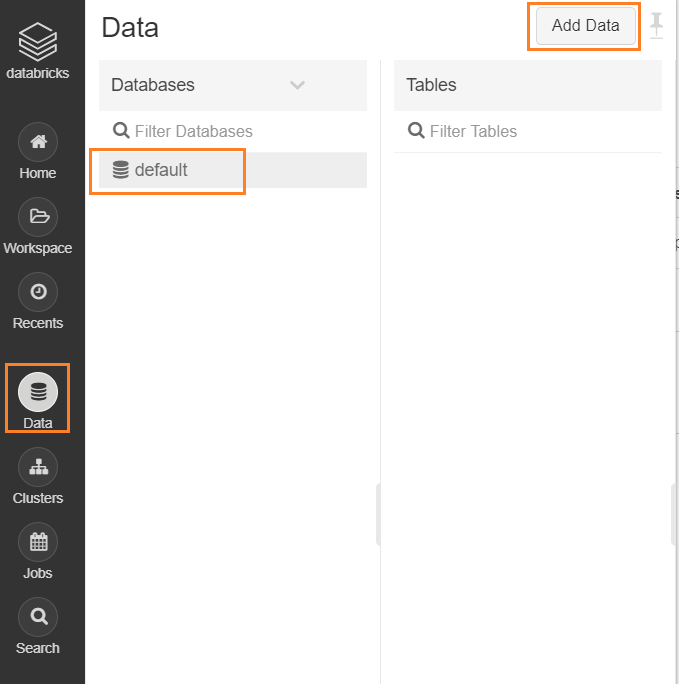
3- Next, we will import our data set, click on Data then choose default database, then click on Add Data button
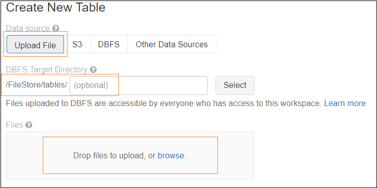
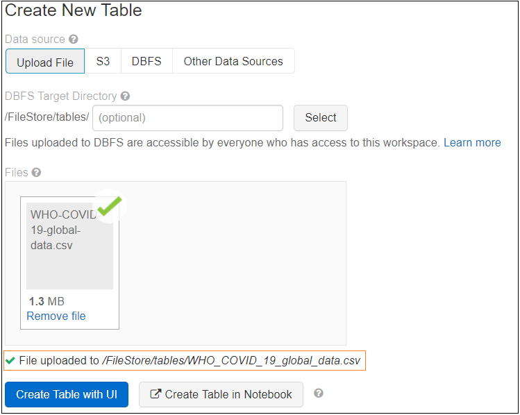
4- Choose to create a table by Upload File, enter directory name if needed, then click on Browse to choose our csv file we downloaded. as we mentioned before files uploaded using UI will be uploaded to root directory /FileStore/tables/
Click on Create Table with UI, you have another option to create the table in Notebook, as you can see we now have the path where databricks uploaded the file.
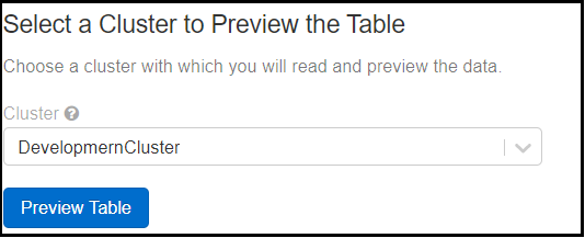
Then choose the cluster to preview the table data before the creation
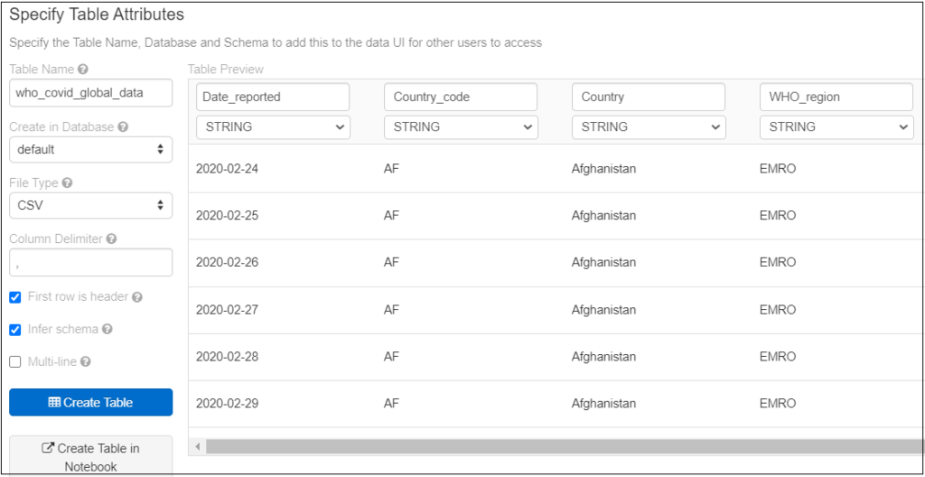
Click Preview Table, now we need to specify some properties before we create our table, such as Table Name, Database, File type, column delimiter, then make sure select First row is header option to get column names from the first records of the file and you can change it if you want to, Infer schema so databricks detect the data type of columns based on available data in the file.
Click on Create Table, then a summary with the table structure and sample data will appear
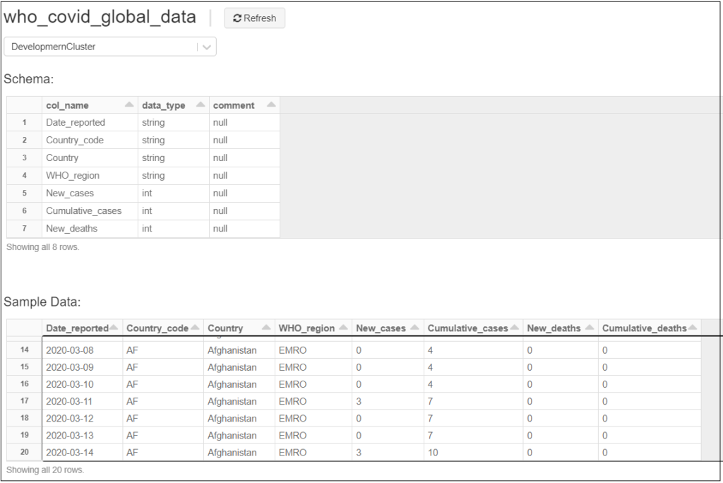
Now our table is ready to start our discovery analysis, next, we need to create a notebook to start querying our table
Create SQL Notebook
1- Click on Workspace from the side menu, then from the Workspace menu click Create then Notebook
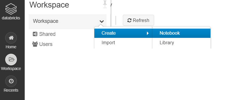
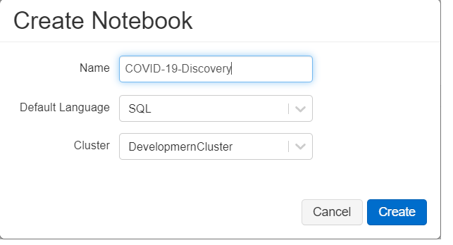
2- Enter Notebook name, then choose the type of the notebook, in our case, we will choose SQL to make it simple, then select which cluster we will use to execute our notebook
COVID-19 Use Case – Discovery Analysis
Preview Data
Let’s review our data, and we will filter on US data as an example
SELECT *
FROM who_covid_global_data
WHERE Country_code='US'
ORDER BY Date_reported desc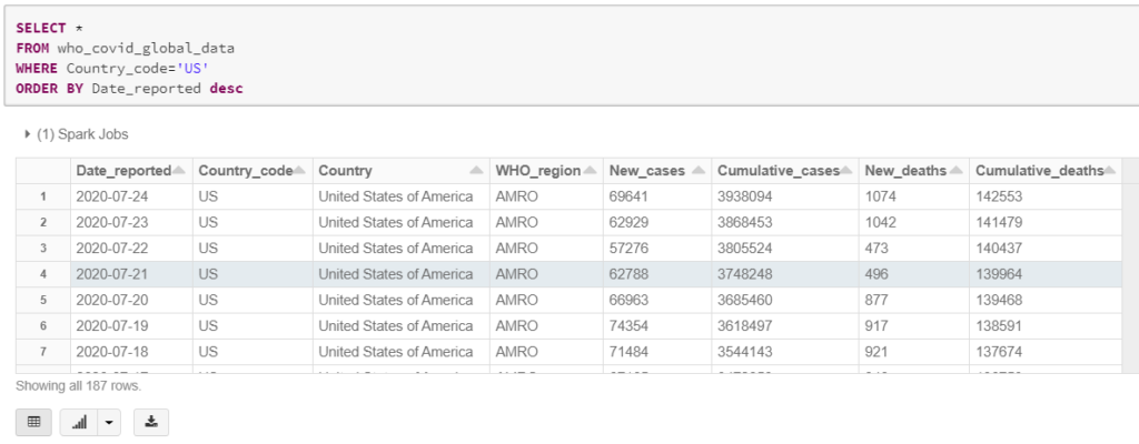
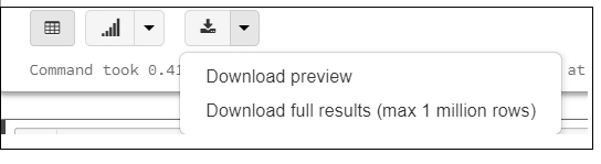
To Save the preview result or the full output of your query click on the arrow beside the download icon as shown below
Get Statistics per Top 10 Countries
In this query, we will get the latest statistics per country, and as per dataset definition, the number of deaths, and new cases are Cumulative numbers so to get the last number we need to get the maximum value
SELECT Country, MAX(Cumulative_cases) as Cumulative_cases, MAX(Cumulative_deaths) as Cumulative_deaths
FROM who_covid_global_data
GROUP BY Country
ORDER BY MAX(Cumulative_cases) DESC
LIMIT 10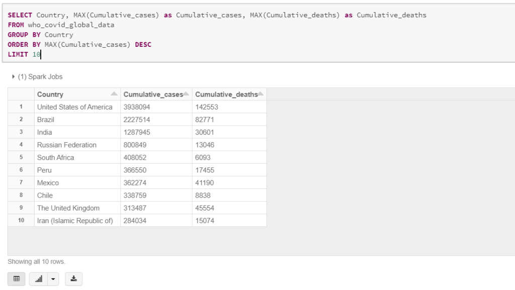
Next, we need to create a pie chart to show the distribution of confirmed cases across states, to create graphs out of query result click on the arrow beside the plot icon and choose the required graph
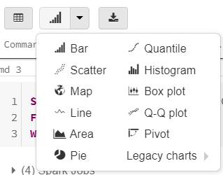
In our case, we will choose a Pie chart, then click on Plot Option

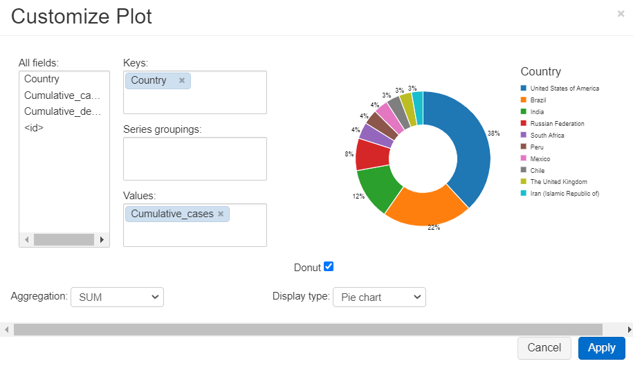
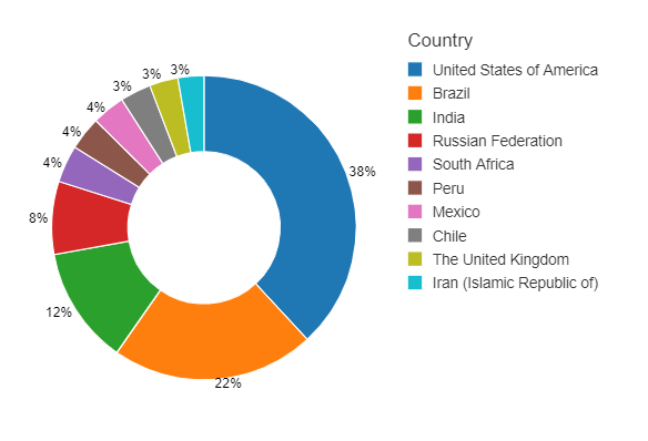
Next, choose keys and values for the chart and also group series if your use case requires that, in our case we need to see Cumulative cases against Country, so Cumulative cases will be our value and our key will be Country, and you can choose the Aggregation method to apply, in our case, it will not affect the results as we already have one record per state, click Apply
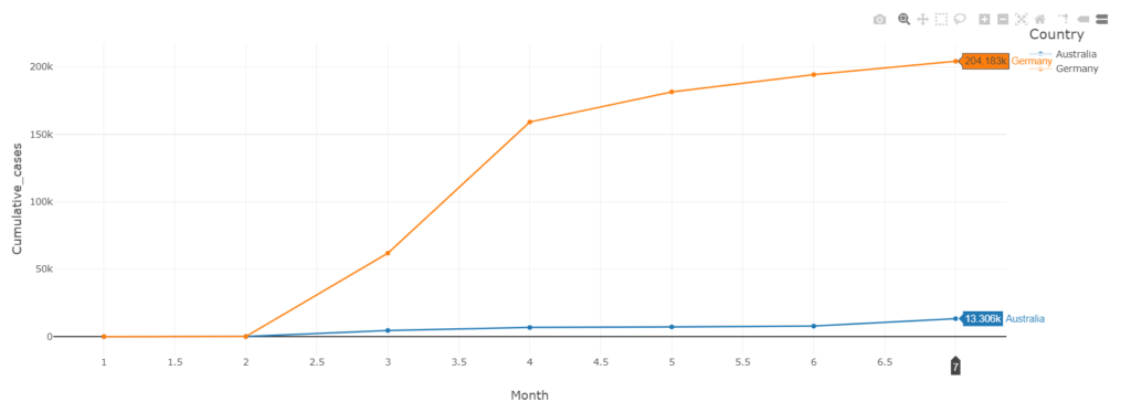
Get Cumulative cases per month Per Country
In this analysis we need to see the number of cases per month per country, to see the monitor the rate of the new cases, in this query we used the MONTH function to get the month number out of the Date_reported column, the query will be as follows
SELECT Country , MONTH(Date_reported) as Month, MAX(Cumulative_cases) as Cumulative_cases
FROM who_covid_global_data
WHERE Country_code IN ('AU', 'DE')
GROUP BY Country , MONTH(Date_reported)
ORDER BY Country ASC , MONTH(Date_reported) ASC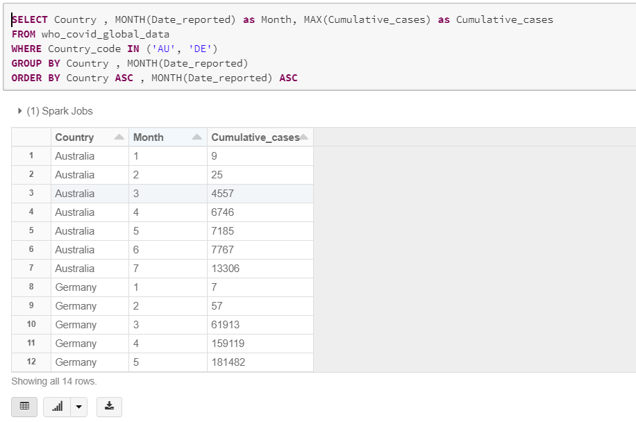
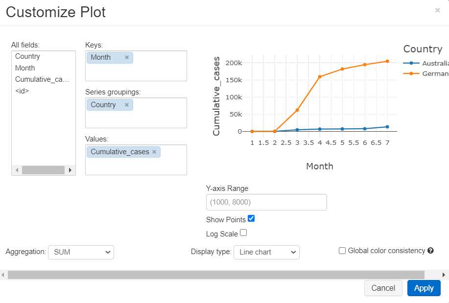
In the query we limited the result to Australia and Germany to be able to visualize the results in a line graph, Plot settings will be as follows, we here selected Month to be the keys, and group graphs by Country, and our measure is Cumulative_cases, click on Show Points option to make data points visible on the graph
Conclusion
As we can see databricks is a very powerful platform, in just a few minutes you can explore, visualize, and analyze datasets without the need to other third party libraries or platforms, in coming articles we will discover more capabilities and use cases that we can apply on databricks